Tom Jolliffe looks at the peak of movie artwork (and subsequent decline)…
Movie making is a long drawn out process. From those first scrawled notes that slowly evolve into script, to the preparation, production and post, so many elements combine to deliver a final product. Then you have the small matter of selling said film. It’s a difficult prospect indeed but there have been many ways to make a film stand out from the crowd. It might be the attached star power. In modern times, its increasingly about the IP, franchise or concept, which makes a film appealing (or a combination of those with big name talent).
For a time, particularly prior to the boom of the internet, a film needed to catch the eye with picture house posters, trade ads and, in the VHS era, cover art. Beginning with the DVD era something happened though. Perhaps a change of tastes, and a very significant move almost entirely away from hand drawn artwork, as well as the evolution of Photoshop etc, lead to a quicker turnaround on digitally formed artwork.
The DVD era began with a strong pull but one which never quite matched up to the initial boom seen in the VHS era. Blockbuster Video’s peak was undoubtedly in the VHS era. This is exemplified in simple terms by the straight to video action genre. The kind of money going into the productions of these films in the mid 80s to late 90s was in retrospect, fairly substantial.
When DVD couldn’t quite match up to the incomings (despite being very cheap to produce), budgets dwindled. There was decidedly less bang for the buck, and from around 2005-2010, even the bigger stars at the top of the video realm were seeing budgets plummet. So, from pre to post, the whole process was more restricted.
As a further consequence, given how effortless (seemingly) a bit of quick Photoshop production was, less money was put into creating the artwork. Presale posters used to attract financing at film markets like Cannes and AFM didn’t need to be too elaborate, but those final territory packages to adorn posters and DVD covers could often feel as if they’d been breezily constructed.
These days the affliction of uninspiring artwork (which honestly accounts for about 90% of films from top to bottom) is even worse, with the digital design tools even cheaper, quicker and more user friendly. Now the penny pincher doesn’t even necessarily need to outsource, it’s become an unnecessary expense.
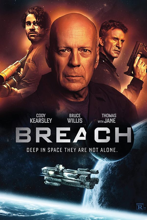
The recently retired Bruce Willis had a prolific outpouring of films in the latter years of his career. Much of the artwork has that floaty head quality and a mish mash of ideas (not always relevant to what will appear on screen). A layer cut-and-pasted over another. They’re not the worst examples you’ll see and certainly at least have a professional gloss you’d expect, but they often feel dispassionately, cynically designed. See also many films of that budget level.
Then look too at the biggest budget films, where undoubtedly many thousands are spent on designing artwork for the film. Too often, little trends form (such as the teal and orange colour combo, or purple and blue) which then spread through film posters like wildfire. Some look good of course, and if you look at the MCU, they require a certain uniformity, but it’s all interchangeable and a little bit boring. Every Tom Holland Spider-Man artwork is indistinguishable from the next, and the recurring ‘home’ theme for the titles make them difficult to tell apart (for the non-MCU fan).
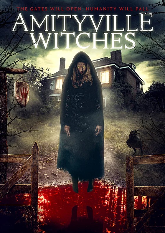
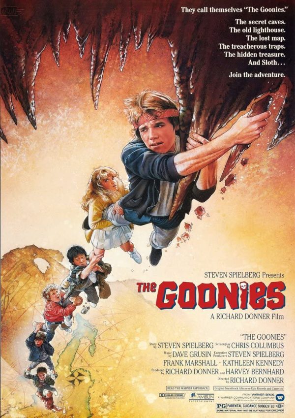
Then in the low/micro budget film world, where budgets are really at a premium, things are even more inconsistent. I’ve had a number of my screenplays film and released, predominantly in the horror genre. These are often drawn designs, but using the modern digital tools over hand-drawn originals from maestros like Drew Struzan. For the most part these don’t have the texture or artistry of paint to paper art. Layers float atop each other rather than feeling blended. They feel as if they’re formed quickly for maximum visual impact.
For my film Amityville Witches as an example, the US artwork doesn’t really represent the film much in anyway (though oversell has long been a goal). Like many low-budget horror covers it looks too digital, and there’s an emphasis on blood that never really looks too much like actual blood. Artwork has always sexed up the film its selling. It’s a given. Got an action film? Throw in some helicopters on the artwork, even if there ain’t a single chopper in the film.
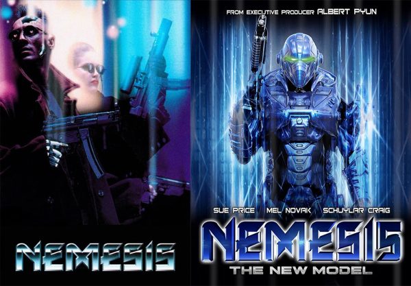
For a good comparison between vintage artwork and far less impressive modern equivalents, check the cover art for Albert Pyun’s Nemesis and compare to the most recent sequel, Nemesis 5 (which Pyun partially endorsed). The difference is massive. Granted the original will have spent significantly more on all fronts, but the original film’s artwork really does grab the attention.
The more recent one isn’t actually terrible, but there’s a feeling that your artwork isn’t as key a sales point as it used to be, and that will become the case even more so now that we’re almost completely away from browsing and picking up films in a physical store. You just need a big font and enough of a visual punch to stand out in thumbnail form. We don’t tend to look as close as we did to a physical poster or a VHS box.
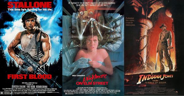
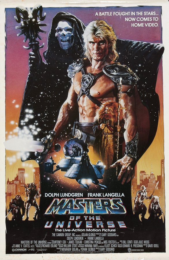
As soon as film became a home product, it needed adequately eye catching packaging. Artwork to this point had often been impressive and some classic era art has a quaint and enduring quality, but once it came to boiling this down to box art in a booming production market, they were to stand out even more. Creating films to bypass cinemas and go straight to video, and an increasing ability to make films cheaply and independently, saw a saturation in the market. Thus whether you were Star Wars (the Original Trilogy had amazing artwork) or a low rent 80’s rip off, the distributors would more often than not try to make great artwork that would catch your eye in the nearest Ma and Pa video store.
For myself as a youngster I was always enamoured by the video store artwork adorning the VHS covers. These would often be the main selling point which would convince me whether or not to rent a film. Films like Die Hard, Predator, Total Recall, First Blood, The Goonies, A Nightmare on Elm Street, the Indiana Jones Trilogy all stood out. Then, the low budget slightly slipshod productions, like Italian sword and sorcery or Mad Max riffs, often looked magnificent based on the covers (even when the actual film was awful).
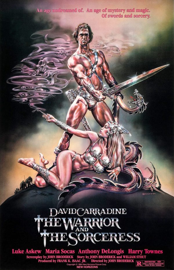
Did almost every David Carradine film from the 80s oversell the main event? YEs. Did they oversell Carradine’s physique? Yes. The films were often (enjoyably) bad, but the fact there had been a concerted effort and a bit of craft in creating these posters adequately fooled the punter into assuming the same care had gone into the production. Dazzled by artists like Struzan and Frank Frazetta, the VHS aisle browser was treated to an art gallery of gorgeous artwork and individuality.
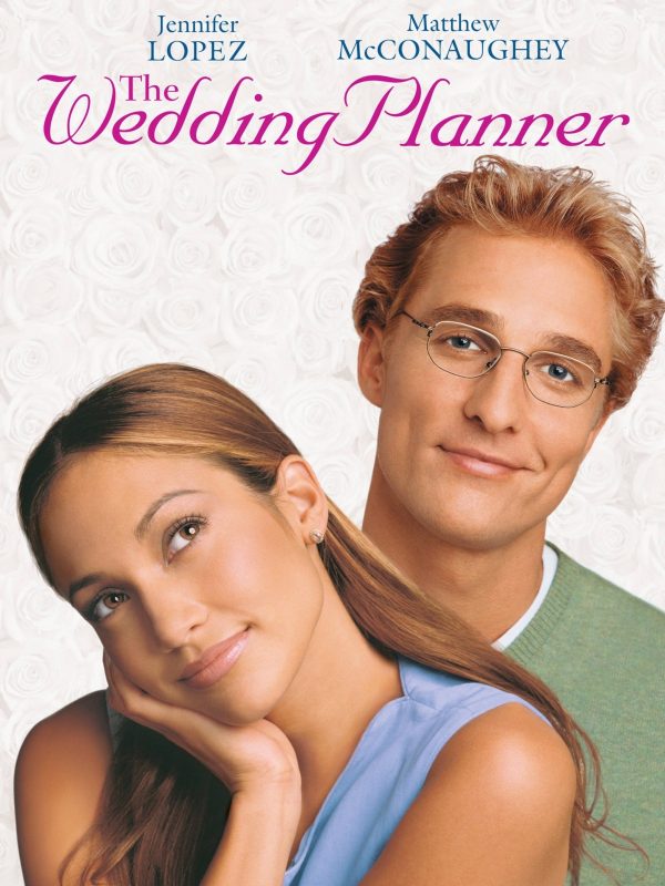
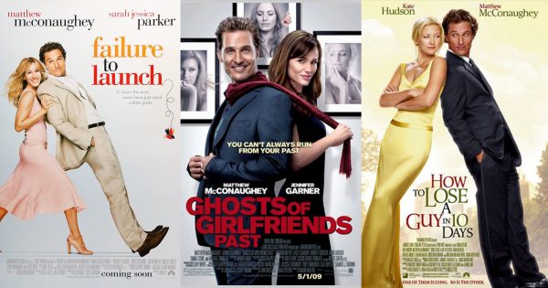
Progressively, from top to bottom, formula is taking over the process. Even Amazon and Netflix productions are foregoing much effort into artwork, at least prior to their films finding some kind of physical release (occasionally they don’t at all). The Netflix streaming thumbs we all scroll through tend to now pick a frame as the main thumb and opt for a bold text. You won’t often even see the original artwork through that channel. Going forward, will great artwork still be necessary? There are certain genre tropes that everyone adheres to in artwork this century too, getting to a point many look the same. How many rom-com posters from 2000 to the present have looked virtually identical?
How often prior to his renaissance did we see Matthew McConaughey leaning backward, gurning at the camera? I’ve even seen pre-release artwork for some of my releases which looked decent, replaced by something less impressive come release, with distributors inevitably wanting to go their own way (or use the companies they’ve maintained a relationship with). So even handing decent artwork over won’t guarantee it’ll be used come release.
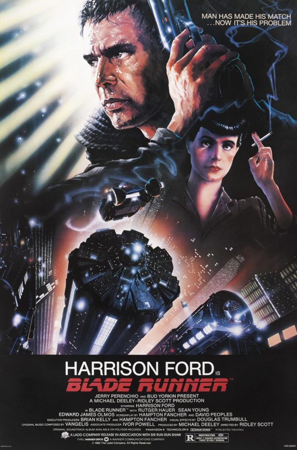
Perhaps my all time favourite movie artwork is the original poster for Blade Runner, by Drew Struzan. It just popped and evoked a feeling of excitement and anticipation for what the film might deliver (which it duly matched). Many of Struzan’s works account for my favourites with an unmistakable gift for bringing the cast to life through his paints.
I could say the same about the films of the era too I guess, but they really don’t make ’em like they used to, and the digital technology and approach to creating posters feels like a pastry with only a few folds, rather than the patisserie crafted depth and layers that the poster artists of yore used to favour. The artwork really did come alive rather than just serve a basic purpose.
On a side note, if you really want some quaint individual charm, definitely check out some Ghanaian movie posters. They’re insane and wholly charming.
What is your favourite movie poster of all time? Let us know on our social channels @FlickeringMyth and my Instagram @JolliffeProductions…
